How Does Responsive Website Design Boost SEO Benefits?

In the present-day world, digital marketing strategies – irrespective of whether they are crafted for B2B or B2C companies – need to be ‘mobile-first’. The importance of responsive website design (or, RWD) warrants a special mention in his context. On average, smartphones account for nearly 54.9% of the overall web traffic figures worldwide. Not surprisingly, businesses of practically all scales are focusing on the optimisation of their websites. A recent report revealed that 8 out of the 10 top websites have mobile-friendly designs.
In terms of availability, accessibility and overall visibility on the World Wide Web, the need for responsive web design simply cannot be overemphasised. Search engine optimisation (SEO) is a key element of online marketing strategies – and mobile-friendly websites can play an important role in ensuring the success of SEO strategies. Over here, we will take a look at how fluid and responsive website designs take up SEO benefits by several notches:
Loading Speeds Are Increased; Bounce Rates Are Lowered
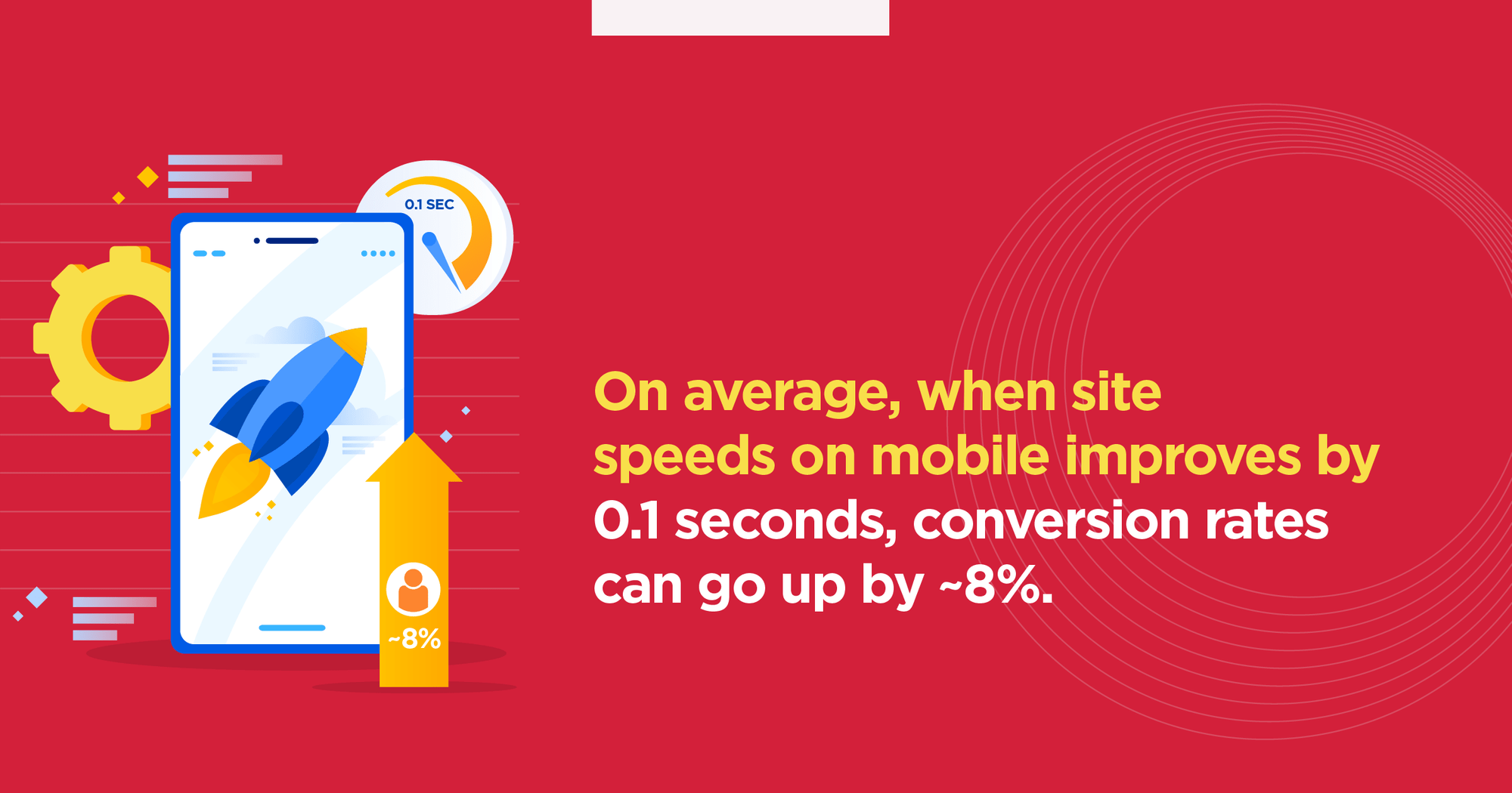
Ever since the Google Speed Update (GSU) arrived around four years back, website speed (i.e., loading speed) has been a major ranking factor in SEO. With seamless RWD implementation, probable inconsistencies in the content and/or the layout of websites are eliminated. As people are increasingly displaying ‘mobile-first’ behaviour, responsive designing methodology is becoming more and more essential. On average, when site speeds on mobile improves by 0.1 seconds, conversion rates can go up by ~8%.
Fast Loading Website Improves Conversion
Related to improved loading speeds, lower bounce rates is yet another important SEO benefit that can be leveraged through mobile responsive design. When people do not quickly navigate away from a website (before completing their website journeys), search rankings are boosted, and overall results are optimised. Content is still the king in digital marketing – but without RWD, SEO strategies remain half-baked.
Better Usability Translates Into Optimised User-Experience (UX)

Optimize Websites for Mobile Devices
From ensuring better accessibility, to easing on-page navigation and delivering cross-device display consistency – the usability advantages of responsive web design can be many and varied. These factors contribute towards increasing the ‘time-on-page’ of visitors. Better usability makes sure that people stay on a site for longer, while chances of ‘repeat visits’ go up as well. This is taken as a signal by Google, of the positive experience that the underlying website is delivering. As a result, the latter’s online visibility is boosted. For around 62% buyers online, the chances of arriving at a purchase-decision are higher on mobile-optimised websites.
Link-Building Activities Receive A Boost
A significant part of SEO activities is building a strong backlink profile for websites. When responsive web design is not implemented (at least, not properly done), sites can become slow, non-responsive and glitch-ridden. Such websites are unlikely to bring in high-authority backlinks from third-party sources. With the help of optimised RWD, link-building activities become a lot simpler – and search engines also ‘understand’ that a site is delivering value to users. The concerned domain gets backlinks across devices, enhancing SEO benefits.
Mobile-Friendly Websites Are Favoured By Google Algorithms
Search engine ranking algorithms change constantly, with new updates being announced on a regular basis. However, certain factors – like content relevance, mobile optimisation and mobile display parameters – have been identified as particularly important over the last few years. Apart from bolstering mobile search results, RWD also helps in enhancing overall mobile visibility of a website (thereby increasing traffic as well). Google is constantly on the lookout to prioritise websites that offer an optimal blend of accessibility, user-friendliness and updated, relevant information to the target audience. Mobile-responsive websites that are regularly updated fit the bill perfectly.
Responsive Web Design Helps Social Sharing Activities
There are uncertainties over the direct impact of social media sharing on SEO. However, when people can easily share content/web pages on the various social platforms – it becomes that much easier to connect with an exponentially larger audience base. Responsive web design helps precisely in this context. By making the navigation structure straightforward and intuitive across devices, RWD ensures that people can share content easily – sending out a signal that the website/web pages are being liked and trusted. This, in turn, can increase total web traffic – which is great for SEO.
Local SEO Campaigns Are Benefitted

A Responsive Website Design Improves Local SEO
The importance of mobile technologies for local SEO is immense. On average, 1 out of every 3 small businesses already have their own mobile applications – and a further 41% have plans to invest on the same in the near future. RWD also plays a vital role in optimising local SEO strategies. If a company (say, ABC) wishes to rank for a keyword like ‘best software company in Mumbai’ or ‘best digital agency in Kolkata’ – responsive designs make it easy for users to type out such KWs and get road directions. This seamless experience helps the company to improve its ranks for such ‘local keywords’. A ‘desktop-only’ website cannot deliver the same benefits – particularly when more & more searches are happening on mobile.
Site Traffic Increases Manifold
With site loading speeds on mobile optimised, consistency of display (content and layout) ensured, and content-sharing made easy – responsive website design paves the way for considerably higher web traffic volumes. In addition, since responsive websites offer top-notch UX to visitors, bounce rates are lower, and ‘page-stickiness’ goes up (i.e., people stay around longer on the website). A recent survey revealed that ~71% of all mobile searches lead to definite, identifiable online actions (which includes purchases/conversions). When more people visit a website – and the percentage of ‘completed web journeys’ go up – the trustworthiness of the site increases. More user-interactions and higher user-retention are great news for SEO.
Responsive Web Design Makes Page Navigation Easier
When a customer starts his/her online buying journey, there are several ‘friction points’ to consider. Among such potential obstacles, a key factor can be poor website navigation structure on mobile devices. Once again, this problem can be done away with through integration of RWD. The overall navigation systems become cleaner and more immersive – enabling visitors to access the information they are looking for, quickly and easily. In other words, mobile-friendliness goes a long way in minimising the customer friction points. Optimised navigation structure of mobile websites and apps increase the likelihood of purchase actions for around 78% smartphone-users.
Potential Pitfalls Of Duplicate Content Are Done Away With

Take Care of Duplicate Content Issues via Responsive Website Design
A business can very well identify the need for optimising their website for desktop and mobile – but the execution can be done wrong. If two different versions of the website are created (with mostly the same content) – content duplicacy can emerge as a serious problem, hurting SEO prospects. Responsive designing eliminates this risk as well – since a single version of the website, optimised for all devices, is created. There are no URL duplications, and consequently, no confusions over the presence of the same content at multiple sources. Of course, there are other duplicate content issues to take care of as well.
Responsive Websites Are Dynamic Websites
Digital marketing in general, and SEO in particular, is not a one-shot game. People on the internet – be it on desktop or on mobile devices – invariably prefer quick & smooth browsing experiences. For this, creating dynamic websites is the way to go, and RWD helps a lot in this regard. A ‘mobile-responsive’ website can automatically track the device on which it is being viewed – and specific codes are run accordingly. Media displays are also optimised, to make the site faster on mobile. Readability concerns are also addressed. There is no way to predict on what device a particular website will be accessed – but RWD can maintain that much needed consistency and dynamism across devices.
According to nearly 73% web design experts, lack of mobile-optimisation is one of the biggest factors behind website drop-offs and high bounce rates. On a YoY basis, mobile internet usage grew by ~47% last year – and with this trend all set to grow stronger – the need for responsive web design is likely to skyrocket in the near future. SEO lies at the very heart of the digital marketing strategies of businesses, and responsive website design can be a game-changer in this regard. That’s precisely why mobile web optimisation is a priority for more than 65% of SEO professionals across the globe. The bottomline is simple: when a website is mobile-friendly, its chances of success go up manifold.
Mobile-responsiveness has emerged as a key indicator of the overall credibility and reliability of businesses. To ensure SEO success and optimal business benefits, RWD is something you simply must pay attention to.


An undying love for movies and a tendency to start reading novels anytime are things that Sayudh, the Senior Content Writer at Brandwizz Communications, is all about. He has a way with words, a penchant for daydreaming, and a wanderlust with a particular weakness for raindrops.
Starting a New Project, or
Want to Collaborate with Us?
Starting a New Project, or Want to Collaborate with Us?
Starting a New Project, or Want to Collaborate with Us?