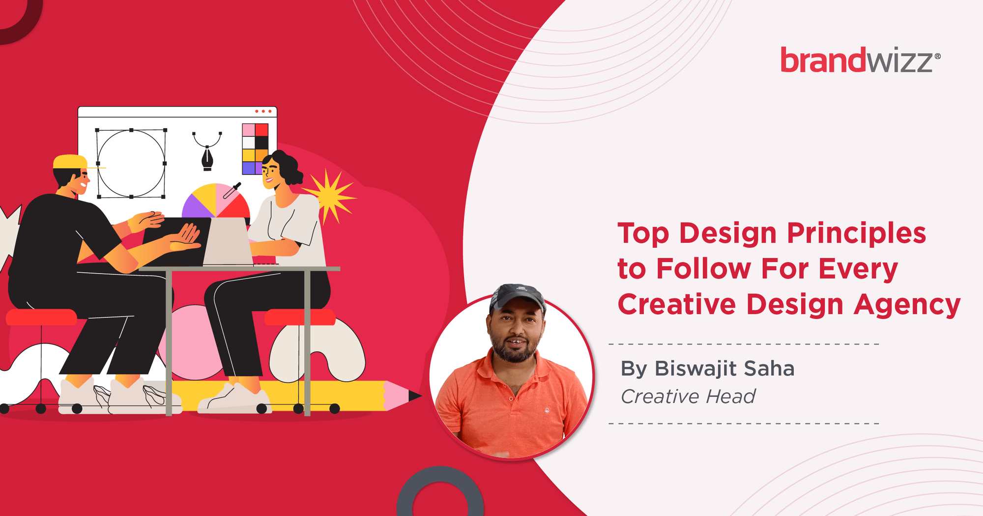
Top Design Principles to Follow For Every Creative Design Agency
The role of design in the domain of digital marketing is a hugely important one. By implementing customised creative graphic design ideas & themes, agencies can establish unique and easily identifiable brand identities and tonalities, thereby boosting overall brand recall values. In a world where competition is increasing by the minute and people are getting more & more options to choose from (for practically any product or service) – standing out in terms of brand messaging, marketing communication and other visual elements is absolutely vital. Well-researched and expertly executed creative design helps businesses achieve precisely this. According to a recent report, graphic design is considered to be an important factor for success by 8 out of 10 small businesses.
In order to ensure that clients get the best value for money and stay a step ahead in their digital marketing activities, creative agencies follow several key design principles. We will elaborate on them in what follows:
Establishing Parts Of Emphasis And A Visual Hierarchy
While every element of a design plays a role, there is always a focal point in creative graphics. Experts from online marketing agencies typically chalk out these most important element(s) in a design (e.g., the brand name) – and play around with the fonts/typography/colours that establish definite points of emphasis. Without this emphasis, the underlying message of the design can get somewhat lost in the clutter.
Closely related to the concept of design emphasis is the need to establish a visual flow or a ‘visual hierarchy’ from the very outset. By manipulating the colour schemes, element sizes and item positioning – designers can determine the sections that would capture the most (and the least) attention. In general too, the design hierarchy influences the order in which a particular design or layout is viewed. Buttons, navigation links, CTAs (calls-to-action) and webpage titles are some design elements that should be, as a rule of thumb, given prominence.
Maintaining White Space and Contrast
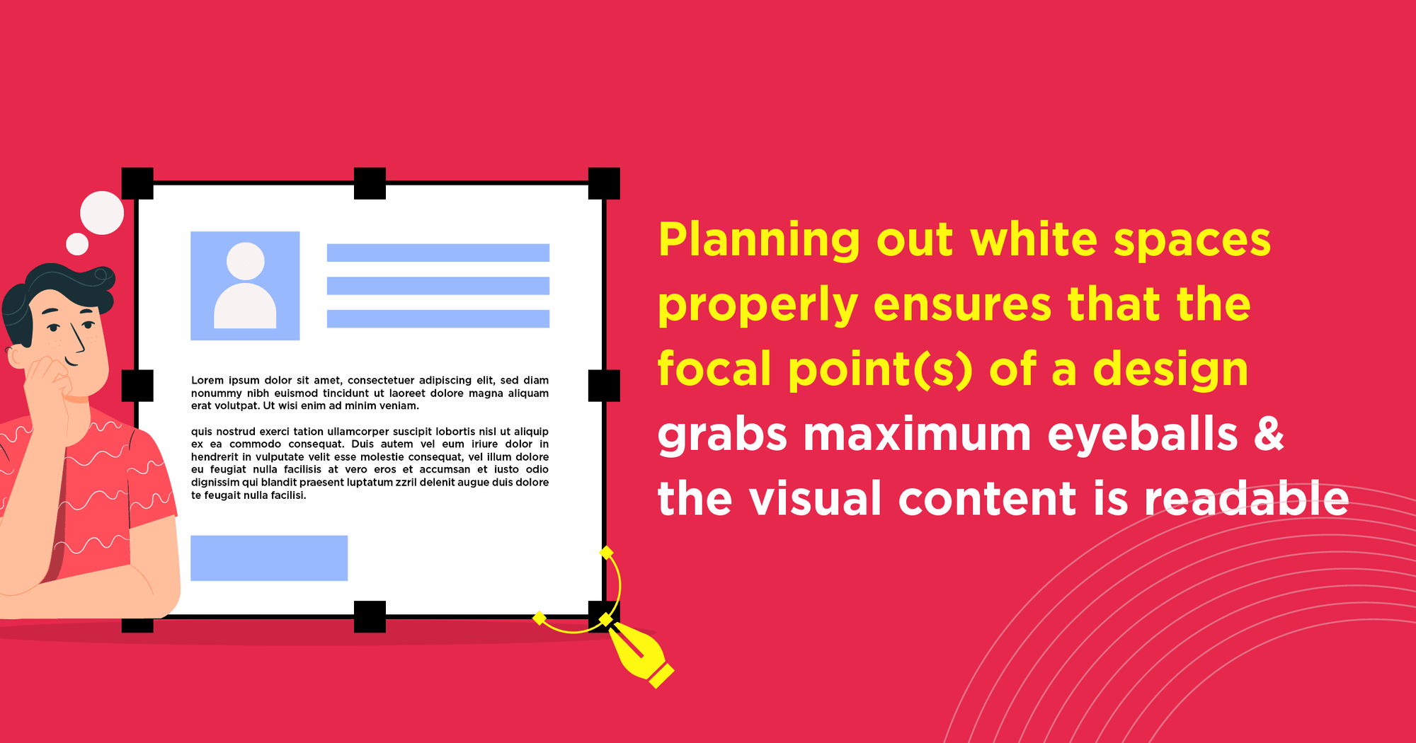
Overcrowded, messy visuals serve no purpose whatsoever. For a design to convey its underlying message, it needs to be easily scannable – and that’s precisely why any top creative design agency in Kolkata follows a consistent white space (also known as ‘negative space’) plan in its design schemes. Planning out white spaces properly ensures that the focal point(s) of a design grabs maximum eyeballs, the visual content is readable, and there is a very evident neatness & sophistication to the design. It is important to remember, ‘white space’ is not ‘lost space’.
Make the Visual Content More Understandable
A design composition can have multiple elements. For it to be visually interesting, the differences between the different elements have to be smartly highlighted. For this, creative agencies use bright colours, oversized objects, shades, and other unique visual qualities – to establish a contrast. The contrast is instrumental in grabbing people’s attention, and ensuring that design message is seamlessly conveyed. In digital marketing advertisements, product design posts, brand communications & more, contrast is an absolute must-have.
Must Read: Custom Design Vs Template Design: Which Is Better for Your B2B Website?
Blending Alignment, Balance and Repetition
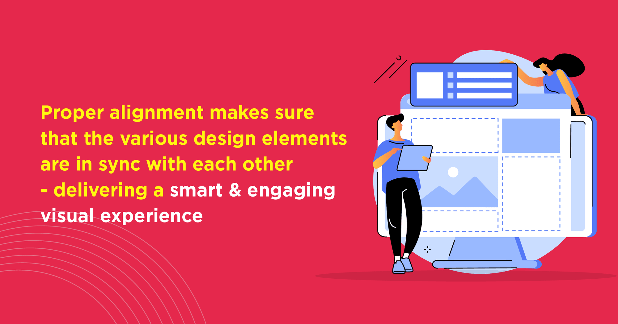
At times, a cursory glance at a design can give the impression that something is not quite right with it. More often than not, such ‘visual bugs’ arise from errors in alignment in the design. Proper alignment makes sure that the various design elements are nicely in sync with each other – delivering a smart & engaging visual experience. Based on the underlying creative ideas, and of course brand requirements, design elements can be placed symmetrically or asymmetrically.
Deliver Smart & Engaging Visual Experience using Various Design Elements
Giving distinct weightage to the different elements in a design is an important prerequisite of efficient creative graphic design. This ‘balance’ can be maintained with the help of texture arrangements, changes in colour and size adjustments. When the correct design weightage is maintained, the creative as a whole has the required balance and equilibrium.
When it comes to establishing brand identities and boosting brand recall values through creative designing, consistency matters in a big way. Shapes, logos, fonts, images and other visual cues are often repeated – to constantly reinforce ideas and the different design elements. In fact, repetition is a highly useful strategy in content designing, since it ensures that certain visual elements are always associated with a particular brand.
Understanding Typography and Proportion
Every brand has (at least, it should have) its very own personality (i.e., casual, serious, fun, quirky, etc.). By availing the services of a creative design agency in Kolkata, businesses can incorporate this important factor in their visual communications. In addition to the brand messaging per se, the way in which it is presented also has to be paid attention to. Agencies select the typography (text style, fonts, size, etc.) to reflect the brand personality and to add a distinctive flavour to the marketing communications. Implementation of the ‘right’ typography is a subtle affair – but its importance should never be overlooked.
Unless the elements of a visual composition have the correct combination of weight and size, the overall alignment of the design gets hampered. Creative graphic design experts are adept at doing the required R&D – for coming up with ideas on the correct size and placement of design elements. Broadly speaking, the smaller elements are generally viewed as less important than the comparatively larger ones.
Note: Creative design agencies follow the ‘golden ratio’ – which, in essence, is a mathematical calculation – to maintain the requisite proportion and balance in their visual representations. The much-talked about ‘rule of thirds’ – which involves guidelines regarding the use of grids in design layouts, is also followed by professional creative agencies.
The KISS Principle Still Drives Creative Graphic Design
Everyone knows the acronym for ‘Keep It Simple, Stupid’ – but it is not applied as often as it should be. In the digital space, the attention span of viewers is extremely low – and complicated, confusing designs are almost sure to be skipped by people. Leading creative digital agencies make sure that each design element implemented serves a purpose – and all unnecessary visual items are eliminated (so that the graphics have a leaner, cleaner feel). Generally, using more than 3 fonts or 3 colour schemes in a design is not recommended – and there should never be an information overload. The less people have to ‘think’ while interacting with designs, the better would be the overall user-experience (UX) levels.
Movement, Composition, Unity and Variety
Great designs do not exist in vacuum. There are a plethora of special elements that make a creative representation ‘complete’. For instance, subtle motions and movements (e.g., small animations) can help specific sections of designs get noticed more quickly. For website designing in particular, a creative digital agency also needs to take a call regarding whether the visuals should be symmetrical or asymmetrical – and how the user-friendliness can be enhanced. At the end of the day, good creative graphic design is a marriage of great aesthetics and easy usability.

Good Creative Design Shows Great Aesthetics of the Website
The bottomline of all design practices is the same: to ensure a level of UNITY, so that the discrete design elements & tools can work together as a whole. In other words, the relation between the different design components have to be clear and well-established.
For building visual interest and driving engagements, having good VARIETY across the various design elements (like typography, textures, media, colours, images and others) is vital. This ensures that designs do not appear boring or monotonous, and has that level of intrigue to capture the attention of viewers.
Visual assets form a core part of digital marketing in the present-day world. Types of creative graphic design vary widely – right from original graphics and stock photography, to presentations, videos, data visualisation tools (e.g., charts) & more. The key lies in understanding how branding & communications can be made more unique, immersive, authentic and actionable with the help of graphic design. Things like illustrations, images, infographics and video content have the potential to make online marketing strategies more relatable and meaningful than ever.
Nearly 61% digital marketing experts opine that engaging visuals are central to the success of their online communications. It’s an area that is already important, and is all set to become an even bigger game-changer in the foreseeable future.


Starting a New Project, or
Want to Collaborate with Us?
Starting a New Project, or Want to Collaborate with Us?
Starting a New Project, or Want to Collaborate with Us?