10 UI/UX Best Practices for Real Estate Website Design

While realtors typically prefer communicating directly with prospective buyers via messaging, emails and calls, websites often serve as the first digital touchpoint in the customer journeys. Given that an easily accessible, optimized and responsive website design is an indicator of the credibility and reliability of a real estate business, it is hardly surprising that more than 70% of real estate sales agents have proper business websites, and most companies list their properties on their own sites (along with other details and contact information). In the real estate sector, websites are a powerful tool to drive business growth.
There is a point of concern, however. Real estate websites often tend to have relatively high bounce rates (when visitors abandon the site before taking the desired action) – with the home page and property listings page having, on average, more than 40% bounce rates. More often than not, problematic/poorly implemented real estate website design lies behind this disconnect (and consequently, loss of potentially fruitful leads). Over here, we will highlight some handy UI/UX pointers to help real estate businesses get the most out of their websites:
Optimize Page Loading Speeds

Optimized Page Loading Speed- Can Improve Business Revenue
No one likes (or has the patience for) slow-loading websites. Studies have shown that websites with poor loading speeds can cause businesses to lose upto $2.5 billion annually, with low conversion rates being the biggest point of concern. Websites that take more than 4-5 seconds to load hurt SEO performance as well. That’s precisely why real estate websites need to load fast so that visitors are not kept waiting – and the first impression is a favourable one. In this context, the latest Google webmaster parameters as well as the W3C standards should ideally be followed.
Having Smooth Search Functionality Is An Absolute Must
The world is going ‘virtual’, and property buyers expect to find the information that they are looking for quickly on websites. To facilitate this, any leading web design agency in Kolkata would recommend having dedicated search tools (i.e., a properly functioning search button) on any real estate portal. The search functionality would invariably make the process of finding the ‘correct’ house or property a lot easier for people. In addition, the search query (say, ‘houses in Hyderabad’) should not get removed after the ‘Enter/Submit/Search’ button is clicked. Other search filters, like ‘property type’ or ‘property status’ or ‘price range’ can take up the user-convenience factor further.
Think Photos; A Lot Of Photos
People typically do the bulk of their home-buying research online, before actually visiting a property (or a real estate office). This trend has gained further momentum in the post-Covid era. From HQ images and intuitive videos, to 3D walkthroughs, listing street views & more – there are plenty of visual elements and cues that can be integrated in the website design plans of real estate sites. Developers, however, need to ensure that all media elements are optimized, and the webpage(s) are not cluttered with images that are too heavy. That way, the loading speeds of the site will not be affected – while the web layouts will be visually rich.
Pop-ups Do Not Work; At Least In Most Cases
Imagine this: you land on a website – and as soon as you start scanning the page content, a big pop-up form/ad blocks out your view. A big turn-off, right?
It is always a good idea to avoid including pop-up elements (or minimize them as much as possible) in a real estate business website. In particular, pop-ups should NEVER appear as soon as a visitor lands on a website. If there are video advertisements on any page, disable the autoplay option for them. If people do not find the elements on the website distracting or repulsive, they are more likely to stay on the site for longer (read: lower bounce rates).
Must Read: Top 10 Mistakes To Avoid During Website Design
A Clean Navigation Structure Makes All The Difference In Real Estate Website Design

Proper Website Navigation Offers Better User Experience
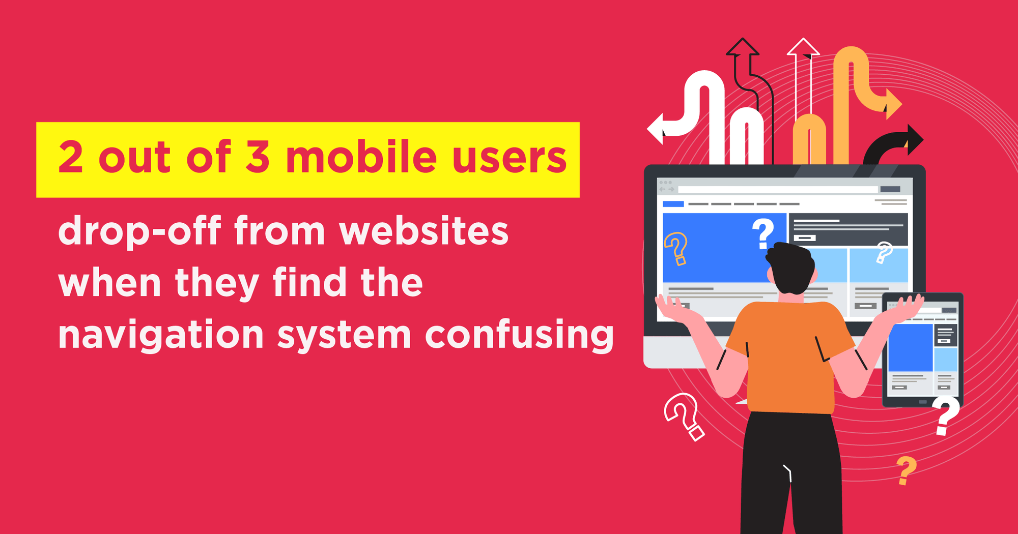
For websites of practically any type, the user-navigation structure plays an important role. On average, 2 out of every 3 users on mobile drop-off from websites when they find the navigation system to be too confusing/complicated. Given that ~93% of real estate buyers from their first impressions about realtors from the visual elements and the navigation experience on the latter’s websites – it is absolutely critical to make the overall user-journey on the site as seamless as possible. As a rule of thumb, a visitor should not have to make more than 3 clicks to access the information (s)he is looking for (the ‘three-click rule’). The website should guide users at every step, so that people never feel overwhelmed or at a loss.
Website Aesthetics Are Important; But Not At The Expense Of Overall Usability
There is no dearth of real estate businesses, and nearly all of them have their own websites. In order to stand out from the competition and try to make their portals ‘trendy and cool’, developers make the folly of going for a visual effects overkill. In the process, the interests of the visitors – who are looking for information and do not want to just admire the uniqueness of the website – are relegated to the background. Poor website loading experiences, complex navigation systems, lack of mobile responsiveness, broken link and problems with the menu structure are often common features of real estate websites that sacrifice usability for aesthetics. Of course, the website needs to look elegant and streamlined, but ensuring its user-friendliness has to be the priority.
Search Options Optimised For Mobile Screens Are Essential
Like all other business websites (B2B or B2C), real estate website design needs to be mobile-responsive. However, that’s not all there is to consider – when it comes to optimizing mobile search experiences. To ease the process of listing searches and property visits on the go, features like area-based search and/or GPS search should ideally be included in the web design. The graphics used should be relevant, to give context to the interaction design (ID) of the website.
Note: A whopping 96% of homebuyers use the internet at some point or the other during their purchase journey. A large chunk of these searches happen on mobile devices, making mobile-friendliness absolutely essential for real estate websites.
The Need For Strategic Calls-To-Action (CTAs)

Strategic Call-to-Action may Increase the Conversion
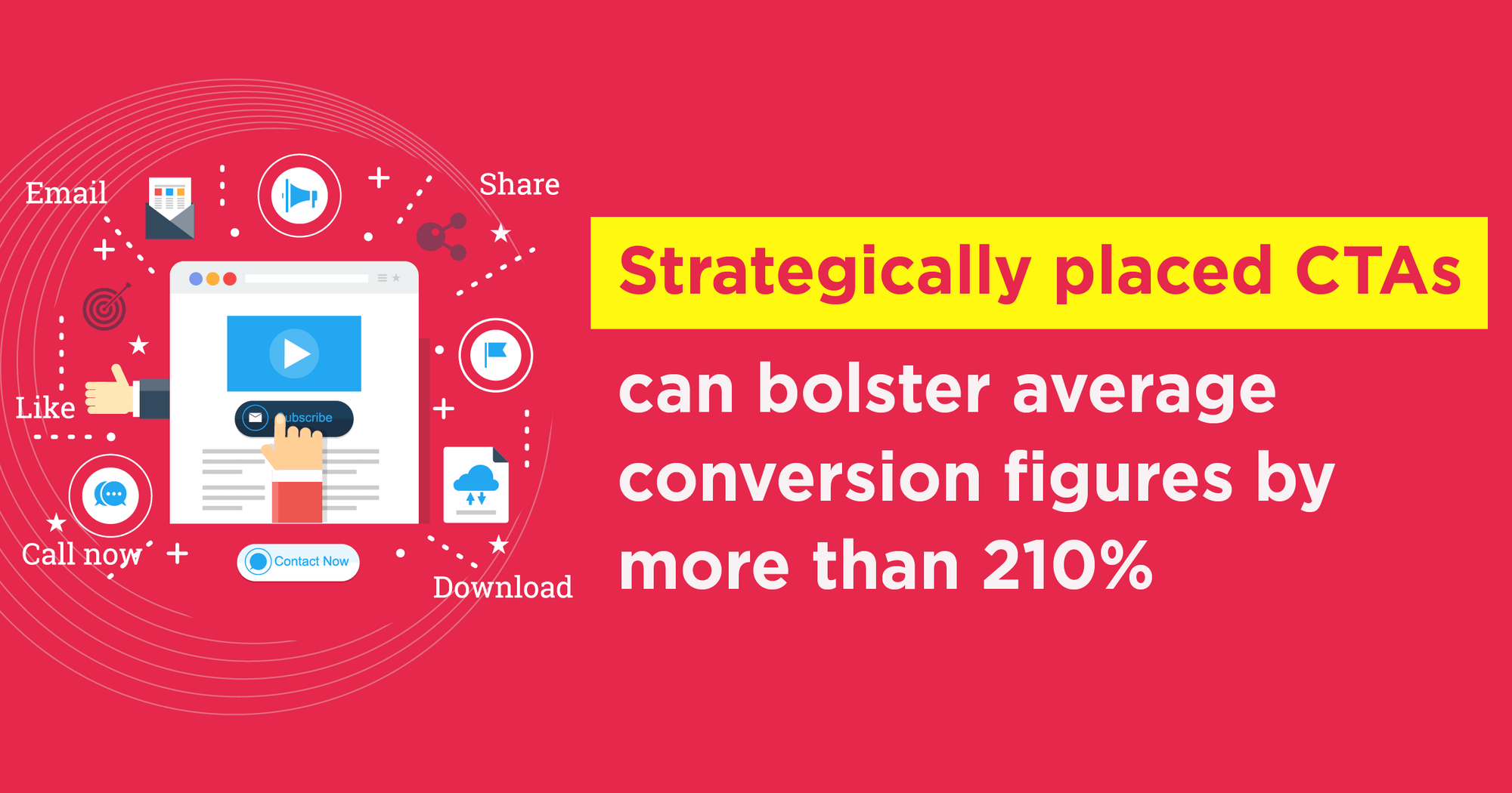
The information presented on a real estate website needs to be accurate, detailed, and most importantly, actionable. This is where the importance of calls-to-action, or CTA elements, come into the picture. Reports have shown that strategically placed CTAs – seamlessly integrated in custom real estate web pages – can bolster average conversion figures by more than 210%. The CTAs in the website should be clear, use properly-researched action words, and be creatively designed as much as possible (preferably, with shadow effects, to replicate the feel of physical buttons). For encouraging user interactions, building engagement levels, and ultimately, ensuring healthy lead generation – the presence of proper CTAs is an absolute must.
Scannable, Relevant Web Content Builds Credibility
Dedicated realtor websites, real estate directories, rental property portals – property websites can be of different types. Tagline(s) can easily be used to establish the brand identity, nature and key purpose of the website. In general too, the content used in real estate websites should be crisp, easily scannable and regularly updated. A flowing storytelling technique should ideally be implemented in the website – to complement the visual elements used on the respective pages. Make sure that the web content is SEO-optimised as well (so that the site gets maximum online visibility). On average, people spend only ~5.7 seconds while browsing through the text on a webpage – and a favourable first impression has to be made within that time.
User Comes First. Always.
The year is 2022. Real-estate buyers in particular, and internet-browsing public in general know better than to just accept whatever they discover on the World Wide Web. Realtors need to make sure that their websites cater to the ever-evolving requirements of users. At the very outset, developers need to ideate and list the factors that would elevate the overall user experience (UX), and facilitate smooth customer journey completions on the website. In this context, the importance of having easy & simplified scrolling structure also warrants a mention. By availing the services of any top website design agency in Kolkata, real estate businesses can optimize their websites and transform them into effective tools for lead-generation.
The real estate market in India is on an exponential path of growth. For the 2022-2027 period, this sector has been projected to grow at a CAGR of more than 9.56%. The market is becoming increasingly competitive – and if due attention is not accorded to making the real estate website design seamless and user-friendly, visitors can have sub-optimal first impressions, minimizing chances of repeat visits. Great UI/UX can serve as the competitive differentiator for a real estate business, ensuring easy user interactions, driving up engagements, and facilitating steady lead generation.
UI/UX optimization can increase overall conversion rates for businesses by upto 200%. As the owner of a real estate business, you simply can’t afford to ignore this factor.

Indrajit is AVP, Technology at Brandwizz Communications. He loves traveling and is a proud father of twin angels. Tech is his passion and he breathes it every moment.


