Top 10 Mistakes to Avoid During Website Design

A business website is, more often than not, the first online touchpoint between a user and the concerned company. On average, 1 out of 2 potential customers believe that the website is a key indicator of the overall credibility and reliability of any business. The importance of website design is, hence, immense – with nearly 95% people forming that all-important ‘first impression’ about a business from its website. As a result, there is practically no room for error over here. Hiring the services of a professional website design agency in Kolkata makes a lot of sense in this regard.
In what follows, we will take a look at some common mistakes that B2B web designers need to be wary of:
1. A Slow-Loading Website
The average internet-user is not patient. When a website takes a lot of time to load properly, user-experience is hampered – and visitor drop-offs are a direct result. In fact, nearly 89% of all losses in web traffic happens due to slow load times of the concerned website. From optimising the images and videos on your website, to checking the modules, plugins and themes that are being used – test all the design elements that can affect website loading speeds. Keep in mind that if the page load time is >5 seconds, the ‘bounce probability’ shoots up to ~90%.
2. Poor Navigation Options
On average, 6 out of every 10 visitors leave a website if they find the latter’s navigation options to be confusing/too complicated. Apart from poor navigation layouts and improper menu configurations, problems can also crop up when the navigation scheme is not optimised for different devices (mobile, tablet, desktop, etc.). The key lies in ensuring that a website’s navigation structure is intuitive enough for all users – irrespective of what device they might be using to access the portal.
3. Not Mobile-Optimised
By the end of 2021, nearly 55% of total website traffic volumes originated from mobile devices. Interestingly, users generally tend to have a positive perception towards companies with mobile-friendly designs – and if the mobile viewability is optimised, chances of return visits to your website are significantly boosted as well. Make sure that your business website is mobile-responsive, with optimised fluid designs and scalability on smaller/larger screens. The proportion of mobile website visitors is growing – and you need to deliver a proper experience to them.
Must Read- Top 5 Website Design Trends for Businesses in 2022
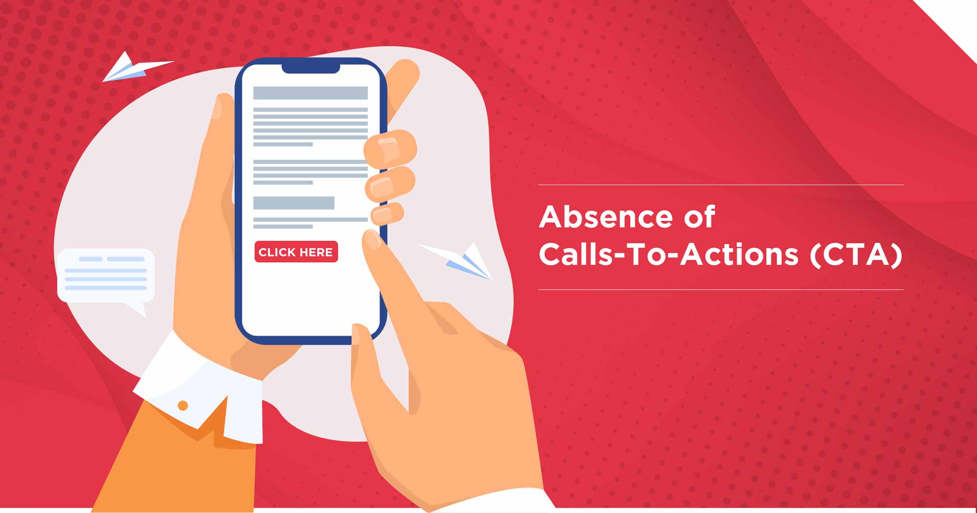
4. Absence of Calls-To-Actions (CTA)

Missing CTA(Call-To-Action)
The art of ‘conversion marketing’ is where something that many business websites go wrong. On average, 70% of websites for small & medium enterprises (SMEs) do not have any call-to-action. In such a situation, the ‘conversion rate’ (i.e., the % of visitors who go on to take the desired action) will remain low – even when there is no problem with the overall web traffic volume. It’s all about ensuring smooth user onboarding and ‘steering’ them in the right direction – if you falter in this regard, your website will remain sub-optimal.
5. An Over-Cluttered Website
There is a fine line of difference between creating an informative website and ending up with a cluttered one. Make sure that all the information is arranged in an aesthetically pleasing manner on the different pages (a single web page should not appear to have very little information or an info overload). The brand messaging also needs to be clear enough – so that users can relate with what they see on the website. Yet another common reason for a lot of website visitors navigating away is the presence of excessively prominent (and intrusive) social media profile links. Of course, you need to provide these details – but they should be placed at strategically designated locations.
6. Problematic Font Features & Typography
User-friendliness is the name of the game, when it comes to deciding how website designs need to be optimised. Many businesses prefer working with a reliable website design agency in Kolkata, to stay away from uncertainties in this regard. Check and double-check the readability of the content (including the blog section) of your website. Avoid changing the font colour frequently, maintain consistency, and select the font size with care. For mobile viewers, the website content should get auto-adjusted to the ‘right’ format (the basics of responsive design). Comfortable readability is a must-have feature of any business website.
1 out of every 5 visitors leave a website due to the presence of colours that seem too ‘outlandish’.
7. Not Having Proper Searchability
Lack of a properly functioning (and easily visible) search button can hurt the usability of B2B websites in a big way. As a rule of thumb, it should not take more than three clicks for a visitor to access the information that (s)he is looking for. In a day and age when everyone expects instant solutions, poor searchability and/or hidden navigation (i.e., when the navigation menu itself is not easy to view) can ruin the overall user experience. In addition, ensure that your web visitor can access contact details and get in touch without any hassles. The number of clicks required for this is inversely proportional to your conversion rate. It’s that simple.
8. Using Poor-Quality Images
For eCommerce websites in particular, and business websites in general – the importance of using HQ images and graphic elements can hardly be overemphasised. For 90% of online shoppers, the quality of images is the single-most important indicator of the credibility of a site – while studies have shown that using relatively larger image size can pull up sales by upto 9.5% (other things remaining unchanged).
It is also important to understand that – in many cases – videos with default autoplay – do more harm than good. People should be motivated to check out the video content on their own – it should not be forced on them.
In case your website has ads, make sure that such advertisements are not intrusive, and do not hurt the overall UX.
9. Not Connecting With The Target Audience
Designing a B2B website without doing adequate research on customer profile(s) is an absolute ‘no-no’. Based on who will view your website, you can implement very formal & corporate designs, or a funky tone, or a more cool and hipster feel. Neglecting this aspect can create a disconnect with users – leading to high bounce rates. Web designers also need to use tools like CSS grids, breakpoints, flexboxes and floats in a smart manner. With carefully researched and expertly implemented designs, an additional degree of familiarity can be established that’s crucial.
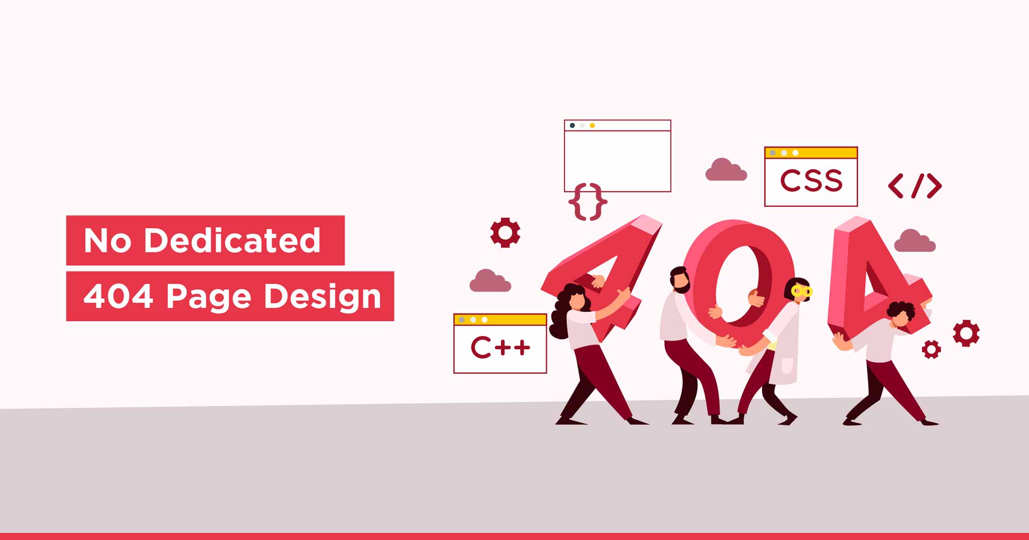
10. No Dedicated 404 Page Design

Custom 404 Page
Broken links happen. However, that does not mean that you will lose your traffic due to such problems. Often dubbed as the ‘silent traffic killer’, having a very basic 404 page can cause nearly 37% of visitors to simply navigate away from their website. In terms of search engine optimisation (SEO) too, the absence of a custom, relevant template for 404 pages can pose problems.
For websites with financial transaction options (i.e., online payment), having a HTTPS certificate is an absolute must. In its absence, the trust-factor about your business takes a hit and conversion remains low.
While business websites of course need to be information-rich and regularly updated, a combination of engaging content, aesthetic appeal and ease of navigation needs to be maintained at all times. A whopping 60% of online users have a clear preference of interacting with websites that are nicely & professionally designed. Over-complicated and/or amateurish design mistakes can turn off visitors – resulting in lost leads (less than 11% visitors return to a site after having a poor experience at the first time). Any leading website design agency in Kolkata can help its clients in avoiding such design errors, and ensuring that the websites are optimised. It takes only around 50-55 milliseconds for people to form their first opinion about your business, and you need to avoid design mistakes – so that your business website has the maximum impact.

Indrajit is AVP, Technology at Brandwizz Communications. He loves traveling and is a proud father of twin angels. Tech is his passion and he breathes it every moment.


